Israel Tax Authority
The personal area of the Israeli Tax Authority is where employers, accountants and private citizens meet the state to report, pay and ask. Redesigned around one goal: reduce the complexity and uncertainty of dealing with government, so people know where they stand, what to do next, and that it went through.
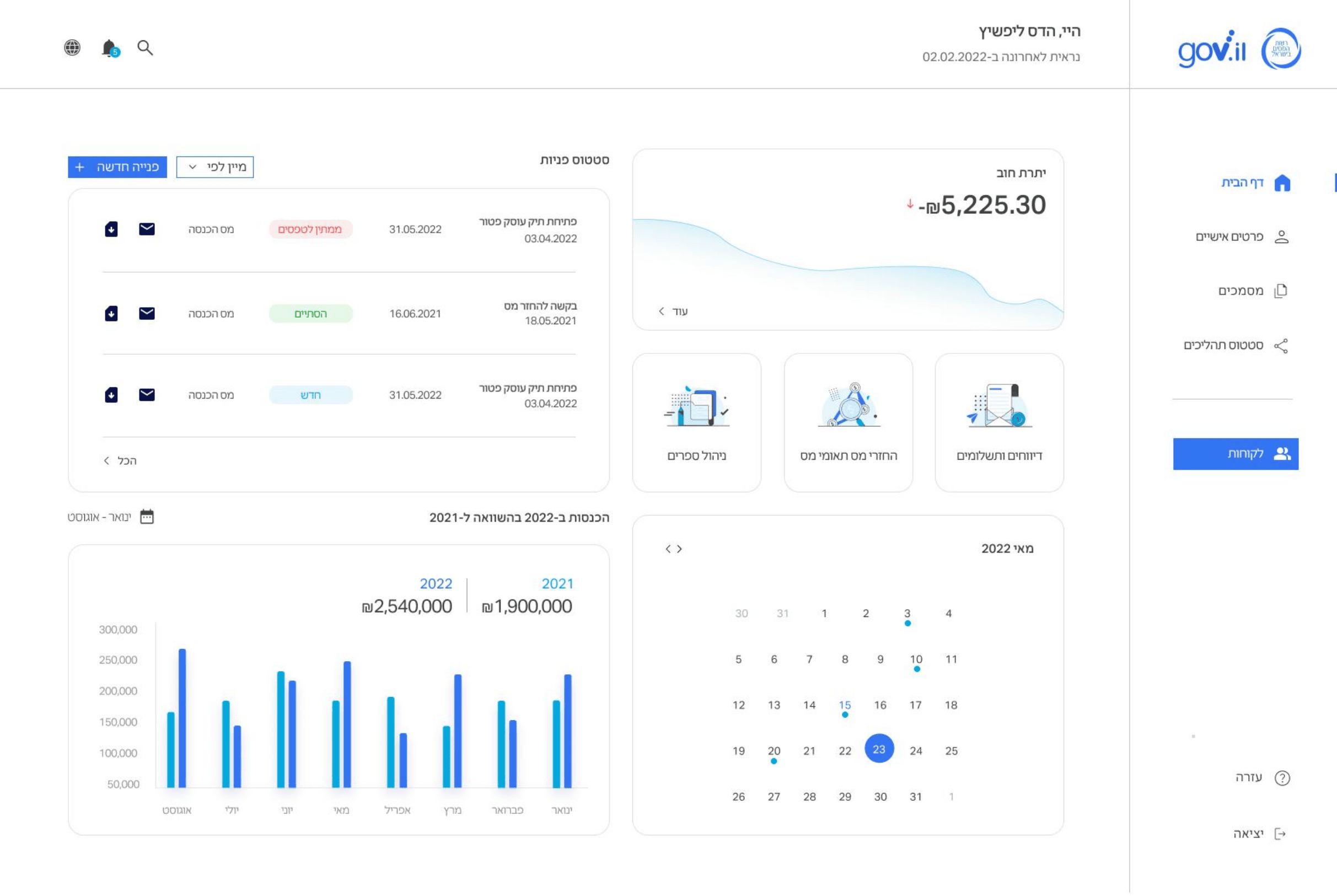 NotificationsSearchNavigationOutstanding balanceGovernment servicesInquiry statusIncome vs 2021
Project Snapshot
The Challenge
Government systems tend to fail the same way: everything is technically present, but nothing is prioritized. The Tax Authority's personal area offered dozens of actions with no hierarchy, no real navigation, and no sign of where a request stood — so people couldn’t find what they needed, and never felt sure it worked. The redesign had to turn that wall of options into a service people could read.
Everything, at once
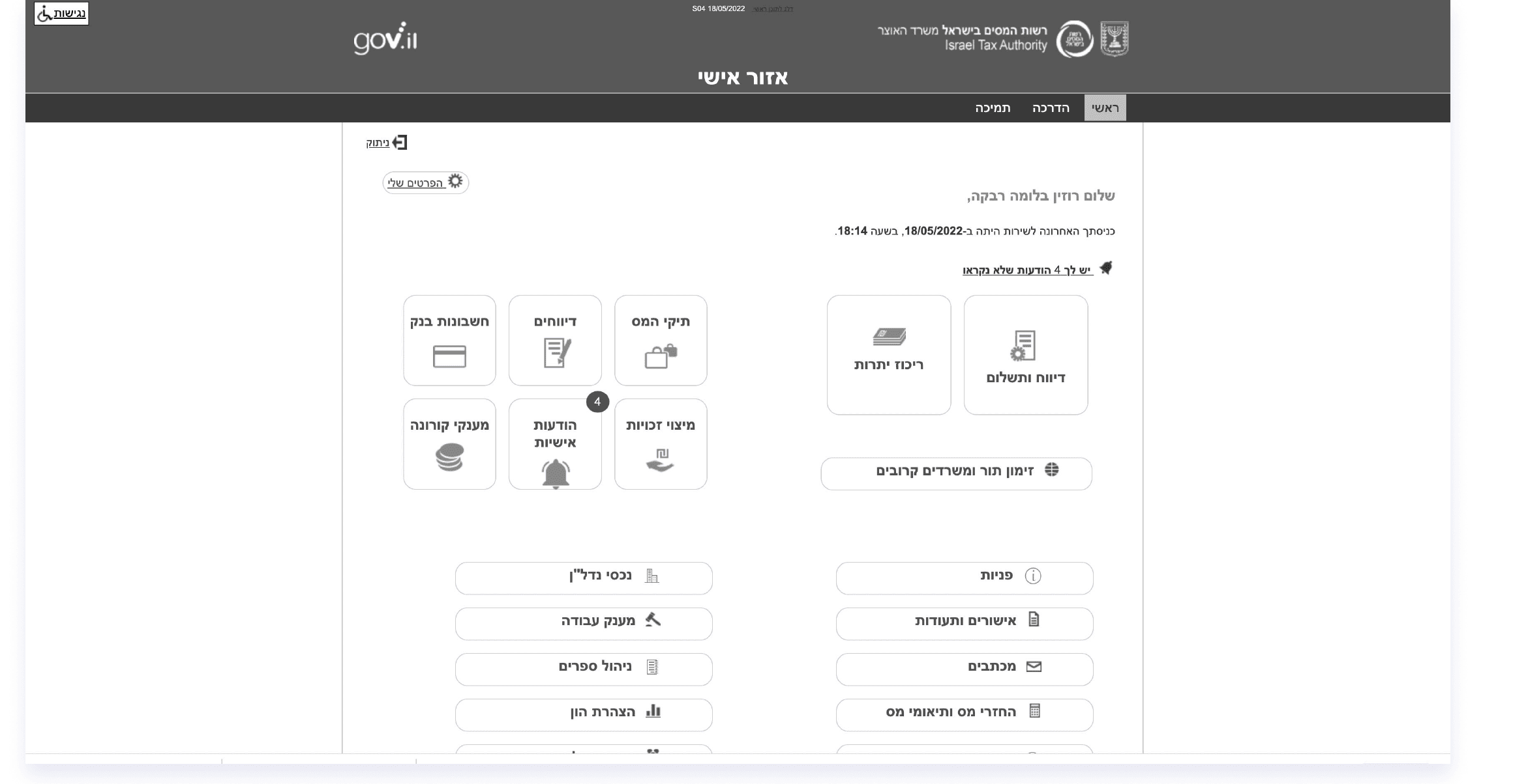
Every action the authority offers, on one flat page.
Hard to act
Reaching a single task means wading through the rest.
Nowhere to turn
No hierarchy and no way to move between actions.
Did it work?
No visible status — 'was my request received?'
Clarity & trust
A service that shows where you stand and what’s next.
Research
Users complained about not understanding the system and the hassle of reaching the action they needed. Interviews across groups confirmed the problems and — crucially — showed the audiences are not one public but three, each with a different relationship to the tax authority.
User interviews
Interviewed employers, taxpayer representatives (accountants) and private individuals — each confirmed the core problems and added needs specific to their group.
Competitor analysis
Studied financial and service systems offering similar interactions, and patterns for behavior in complex systems.
Systems analysis
Examined the existing personal area as it was — dense, flat and unstructured, with no hierarchy or navigation.
Key Findings
No overview
No general indication of operations or the status of payments and reports.
No hierarchy
Many options, no order — and many rarely applicable to the person looking.
No navigation
No way to move between actions; basic operations were hard to reach.
No communication
Most dealings happen through the system, yet there was no area for updates or messages.
No status
Actions were taken with no idea of their state — accepted? missing a document?
Outdated design
Inconsistent fonts and icons made a stressful task feel harder.
Research Synthesis
Before touching a screen, each finding was carried from an observed behavior to a strategic direction and the value it would create — the four insights that shaped the whole redesign.
People can’t find the action they came for.
Time lost wading through irrelevant options.
Surface the essential actions by user.
Promote key actions onto a role-shaped home.
‘What I need is right here.’
After submitting, users don’t know what happened.
Uncertainty and a feeling of no control.
Make request state visible and legible.
An inquiry-status area on the home screen.
‘I can see my request was received.’
Communication with the authority is scattered.
Important messages are missed or lost.
Give the conversation one home.
An alert plus an inbox to read and reply.
‘Nothing important slips past me.’
Accountants and citizens use the system very differently.
One generic view serves neither well.
Shape the dashboard to the user.
Two central dashboards, by how the system is used.
‘This feels built for me.’
Personas
The interviews resolved into three audiences that recur across the tax authority’s users — separated less by demographics than by how often, and why, they show up.

“I need to manage several businesses in addition to my own.”
- A dashboard for several businesses at once
- Handles both income tax and VAT
- Continuous communication with the authority
- Payments and reports throughout the month

“How do I know if the document I sent was received?”
- A dashboard just for their own business
- Mostly income tax
- Less continuous contact, more one-off questions
- Reports or payments every month or two

“I just need some document.”
- Log in rarely, usually for one item
- Want the shortest path to a document
- Little need for ongoing overview
- Speed and clarity over depth
Journey Map
Mapping the current journey shows the emotional truth behind the findings: confidence drops exactly where the system went silent — finding the service, and waiting after a request. Those dips are what the redesign targets.
Information Architecture
Immediately after research I rebuilt the architecture so every action has an obvious home. One login opens the personal area; from there, five clear domains group what used to be an undifferentiated list.
Group by what a citizen is trying to do — pay, ask, track, understand — not by the authority’s internal departments.
Product Decisions
The strategy above set the direction; these are the craft decisions that turned it into the dashboard itself — what to lead with, how to show it, and what to leave out.
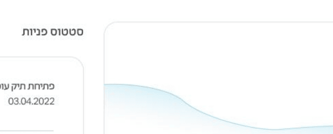
Lead with the outstanding balance and its trend.
WhyStanding and money are the first things a citizen looks for — so they become the loudest element, with a trend line for context.
RejectedA single static number — the citizen would see what they owe but not whether it’s improving.
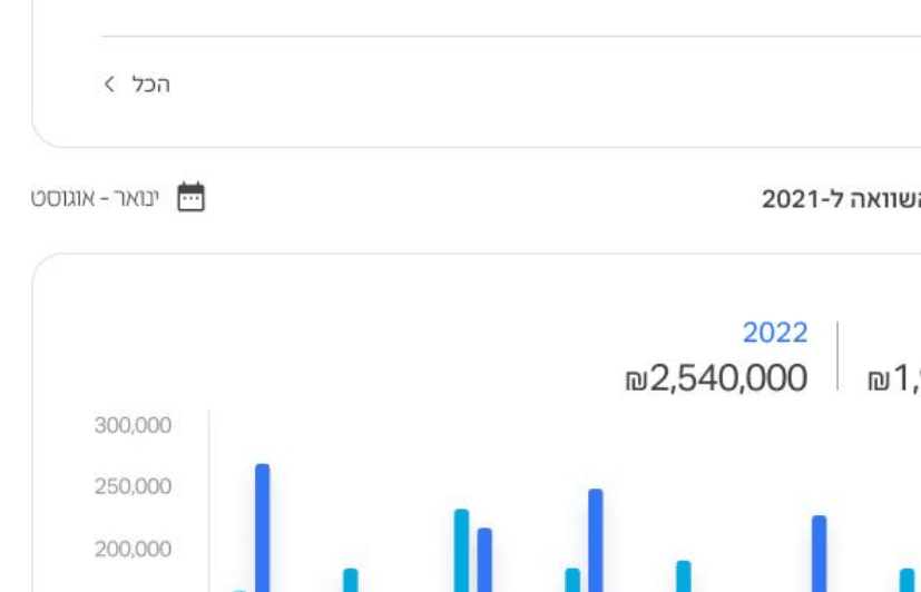
Show income year over year, not a lone figure.
WhyA business reads its health by comparison; 2022-against-2021 tells a story a single total can’t.
RejectedOne current total — the number would lack the context that makes it meaningful.
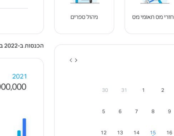
Give the dates that matter a place of their own.
WhyMissed filing and payment dates are the costliest mistakes; a calendar surfaces them before they pass.
RejectedDeadlines buried in text — key dates would hide inside notifications and get missed.
Make the core services illustrated entry points.
WhyFor an anxious, occasional user, a recognizable illustrated card is easier to trust and act on than a text link.
RejectedA plain text menu — the services would read as bureaucracy, not as things you can just do.
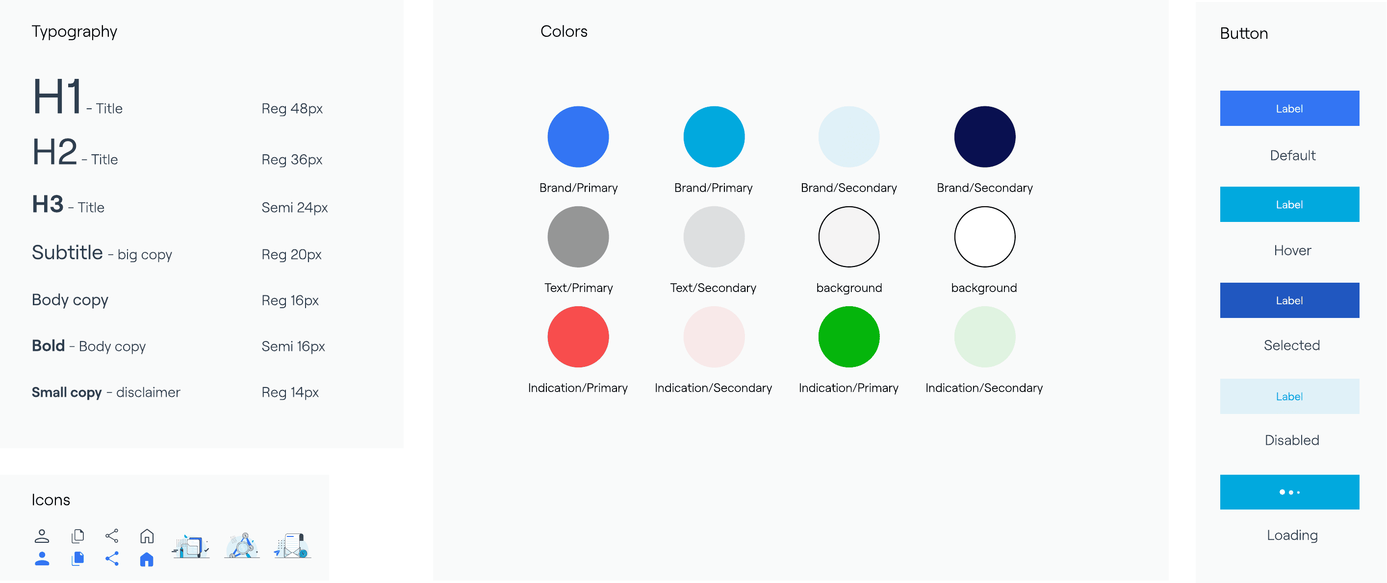
One clean, low-color design language.
WhyInconsistent fonts, icons and heavy color made a stressful task harder to trust; restraint makes it feel reliable.
RejectedKeep the legacy styling — the service would keep feeling outdated and unreliable.
Wireframes
I designed two directions and judged them against what the research asked for — essential actions and status visible on the home screen. Option A kept them in the open with a light side menu; Option B pushed them behind a heavier dark navigation. Option A won.
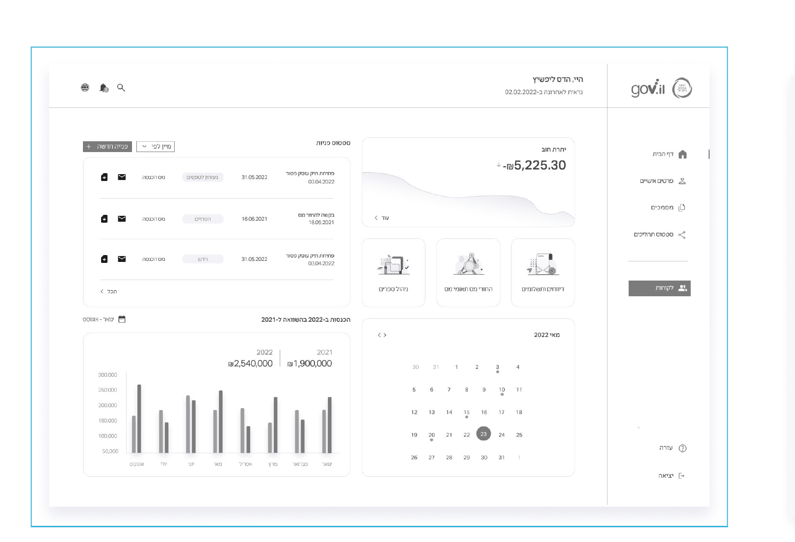
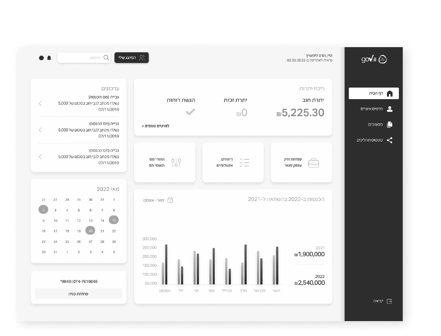
The layout evolved from the flat legacy page toward a grouped, status-first dashboard. Diagrammed here to make the thinking legible; the production UI is more refined.
Dashboard Evolution
The same person, the same tasks — before and after. The legacy area was a flat wall of equally-weighted tiles; the redesign leads with status and the few actions that matter. Every problem the research surfaced, and every decision above, becomes a visible change here.
Design Principles
In a government service, trust and clarity matter more than polish. Six principles kept the redesign honest.
Clarity
The one thing a citizen came for is the loudest element on the screen.
Trust
Every action shows its state — received, accepted, missing — so people always know where they stand.
Hierarchy
Important actions and information come first; the rarely-used recedes.
Consistency
One component library, so a user who logs in as several clients meets the same, memorable patterns.
Simplicity
Fewer colors, fewer type and button styles, no excess decoration — cognitive load kept low.
Accessibility
Built to gov.il accessibility standards, in clear Hebrew RTL, legible to every citizen.
Final Product Experience
Follow the path a citizen actually walks — from ‘where do I stand?’ to a request they can trust is done. The screen-backed steps are real UI; the steps between are the service around it.
Status, balance and essential actions in one accessible view.
The essential actions, promoted onto the home screen.
Outstanding balance and its trend, in plain sight.
Reporting and payment reached in a click, not a hunt.
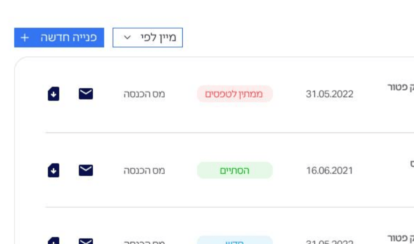
New, awaiting-forms and completed — visible at a glance.
Alerts and an inbox replace the silence.
Confirmation and history — done, and sure of it.
Design System
Across a government service used by very different people, consistency is what makes the product feel trustworthy and learnable. The system is deliberately quiet — familiar financial patterns, a reduced palette, a single icon language and defined component states — so the same person logging in for several businesses always meets the same, memorable interface.