Fundbox
Fundbox had grown from a single-product lender into a company with several credit products — but the dashboard still showed one. Working with a product manager, a product analyst and fellow designers, I turned behavioral data and real user sessions into the product decisions that shaped one scalable dashboard. The screens are the visible edge; the work was reading evidence and aligning a team around what to build.
 CommunicationFinancial overviewUpcoming paymentPlatform navigationProducts + systemCredit products
Project Snapshot
The Challenge
Fundbox had grown from one credit product into several, but the dashboard still showed one — new products were bolted on and discoverability dropped. With the product manager, the team framed the redesign around a clear business objective: grow draws and origination by making a customer’s whole relationship visible and easy to act on. That business frame, not a visual refresh, is what set the direction.
One offering
The dashboard was designed around a single credit product.
More offerings
The company expanded into several credit products.
Bolted on
New products were added without a home of their own.
Discovery breaks
Customers couldn’t see or navigate what they now had.
Grow draws
Make the full relationship visible — and dormant credit easy to draw.
How the Team Worked
This wasn’t a dashboard handed to a designer to skin. It moved through a multidisciplinary team, each discipline shaping the evidence and the decisions — and the process looped, rather than ran in a straight line.
Framed the objective — grow draws & origination — and prioritized the highest-impact opportunity.
Pulled and segmented the activity data — surfacing that 40.2% of customers never draw.
Watching real sessions explained the why behind the numbers — people glance and leave.
I translated the evidence into information architecture, the shared dashboard model and interface decisions.
Design reviews challenged assumptions and kept the growing system consistent.
Research
The research was a shared effort. The product analyst extracted and segmented the behavioral data; I paired those numbers with FullStory sessions to understand the why, and studied how comparable multi-product financial systems handled the same problem. Three lenses, one question: where is the growth actually blocked?
Competitor analysis · me
Analysed comparable financial systems and patterns for behavior in complex, multi-product products.
Behavioural data · Product Analyst
The analyst pulled and segmented the activity data; together we read what it meant for the product.
Session evidence · FullStory
Watching real sessions explained the numbers — where people hesitate, and why they leave.
How customers actually behaved
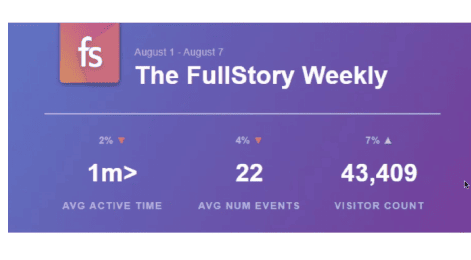
Watching real sessions surfaced the shape of usage — short active time, few events per visit. Customers weren’t exploring; they came, glanced, and left. That qualitative read told the team the dashboard had seconds to make a customer’s financial state legible.
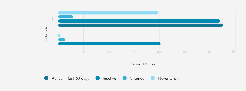
40.2% of customers never draw
The analyst segmented the activity data and surfaced the number that reframed the project: of customers who never defaulted, 32,477 had never drawn at all. A large base of dormant credit — and, tied to the business goal, the single biggest lever for growing draws. Surfacing available credit and a draw entry point became a first-class goal.
| Ever defaulted | Active (30d) | Inactive | Churned | Never draw |
|---|---|---|---|---|
| No | 19,764 | 2,804 | 31,952 | 32,477 |
| Yes | 255 | 1,257 | 20,206 | — |
Why the dashboard shows four draws
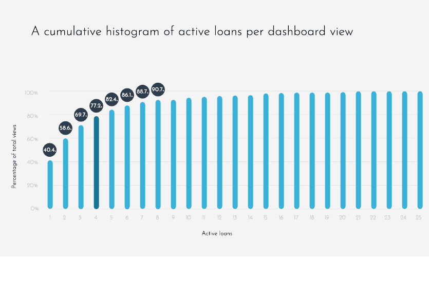
Rather than guess how many loans the view should hold, we answered it from the data. A cumulative histogram of active loans per view showed the median customer has 4 loans, and four cover roughly 77% of all views. The Draws area was sized to that number — enough for almost everyone, without overwhelming the rest.
Personas
The behavioral segments had faces behind them — business owners who rely on fast, non-bank credit and act in short, decisive bursts. The personas kept every decision anchored to a real need rather than an internal preference.

Needs to pay salaries and will have cash in a few days — he needs a short-term loan now.
Bureaucracy consumes time he doesn’t have, and fees are very high.
A quick loan, without fees, repaid within a few days.

Regularly opens new locations and needs a line of credit to bridge until each new store turns a profit.
Raising her limit through a bank is slow and expensive, and she prefers flexible credit outside the banking system.
Flexible, fee-light credit she can draw on repeatedly as she scales.
Research Synthesis
Before any screen, each finding was carried the whole way — from the evidence, through the team’s interpretation, to the opportunity it opened, the decision it drove, and the business goal it served. This is the strategy the data pointed to.
FullStory — customers glance briefly, then leave.
Financial state isn’t legible fast enough.
Make the whole relationship readable at a glance.
One dashboard surfacing every product, payment and message.
Engagement
Activity data — 40.2% never draw despite available credit.
Dormant credit stays invisible and unused.
Surface available credit and a draw entry point.
Draw becomes a first-class action on the home screen.
Draws & origination
Loan histogram — median customer holds 4 loans (77% of views).
A list tuned to no one fits no one.
Size the Draws view to the real distribution.
Draws designed around four typed loans.
Engagement · clarity
Session & support signals — messages get lost.
‘The message I saw yesterday disappeared.’
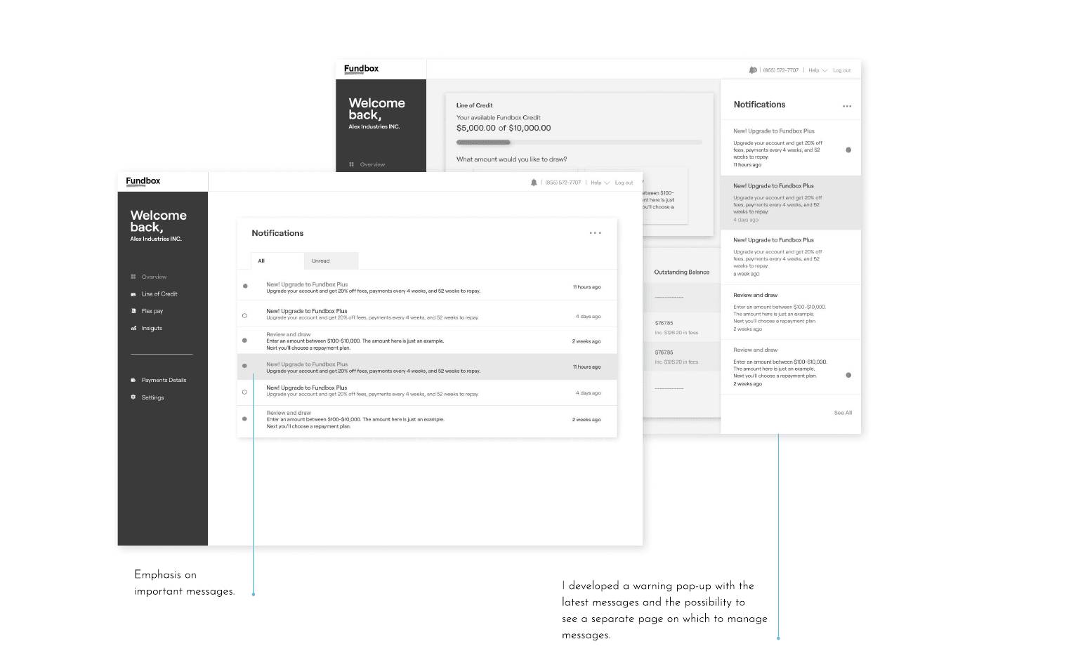
Give communication one prioritized home.
A message hub — alerts, promotions and an inbox.
Retention
Information Architecture
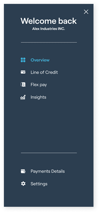
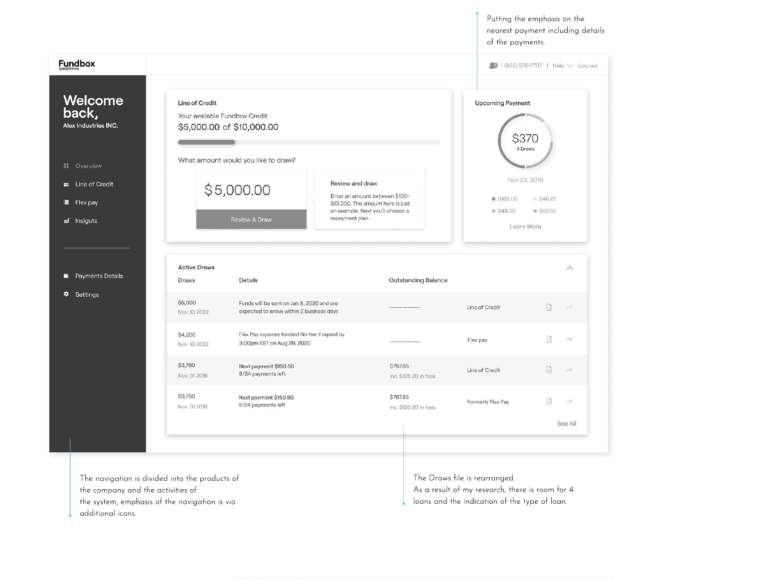
With the direction agreed, I rebuilt the information architecture so it could carry the whole product family. The navigation separates the company’s products from system activity, and the dashboard collapses what used to be scattered — credit, draws, the nearest payment and messages — into one grouped view.
Group by the customer’s question, not the company’s org chart: ‘how much can I draw, what do I owe next, and what do I need to know?’ — answered on one screen.
A Shared Product Model
The IA needed a structure the business, research, design and build could all agree on — so I framed the dashboard as a shared product model: one home, one navigation model and one design system, with each product a module inside it. It emerged from the evidence (surface every product), the business goal (make growth easy to add) and cross-functional alignment — a common language for what the platform is, so a new product is a new module rather than a new redesign.
A shared model costs more up front than a one-off screen — a navigation model, a design system and module contracts to maintain and align on. The return is a structure everyone builds against, so the next product ships into a home that already exists.
Product Decisions
The synthesis set the strategy; these are the interface-level calls that carried it — each tied to the evidence behind it, the business goal it serves, and the trade-off the team accepted.
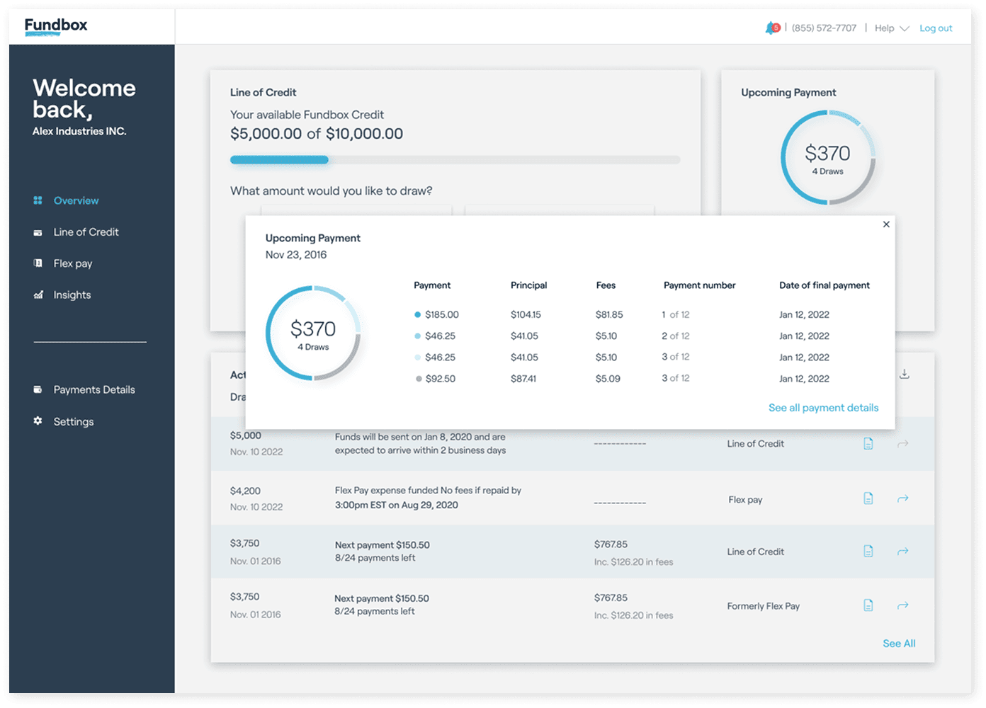
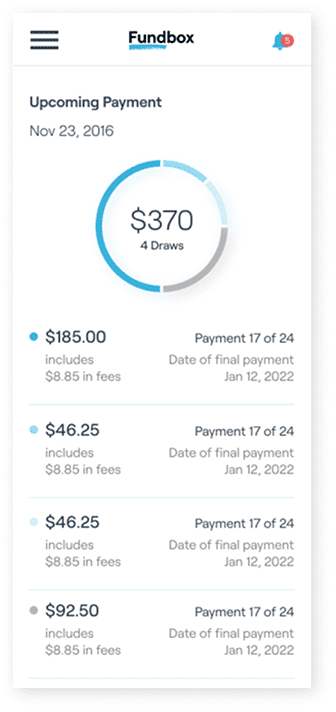
Sessions showed customers couldn’t tell what an upcoming payment consisted of.
Transparency reduces confusion and support load — supports retention.
More detail on screen, and a payment model to maintain.
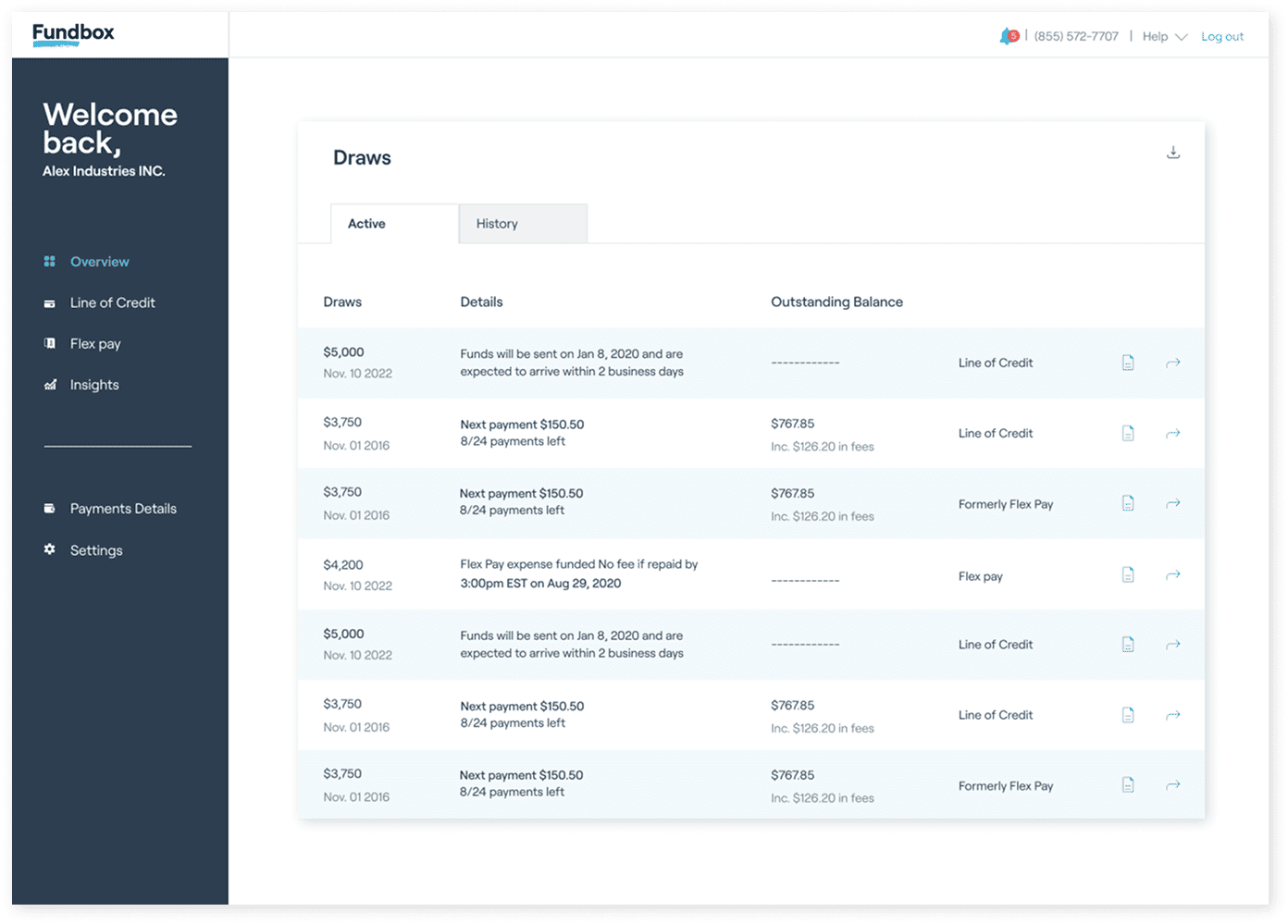
Multi-product customers couldn’t tell one loan from another.
Clear product identity aids discovery — supports origination.
Denser rows; a type taxonomy to keep consistent.
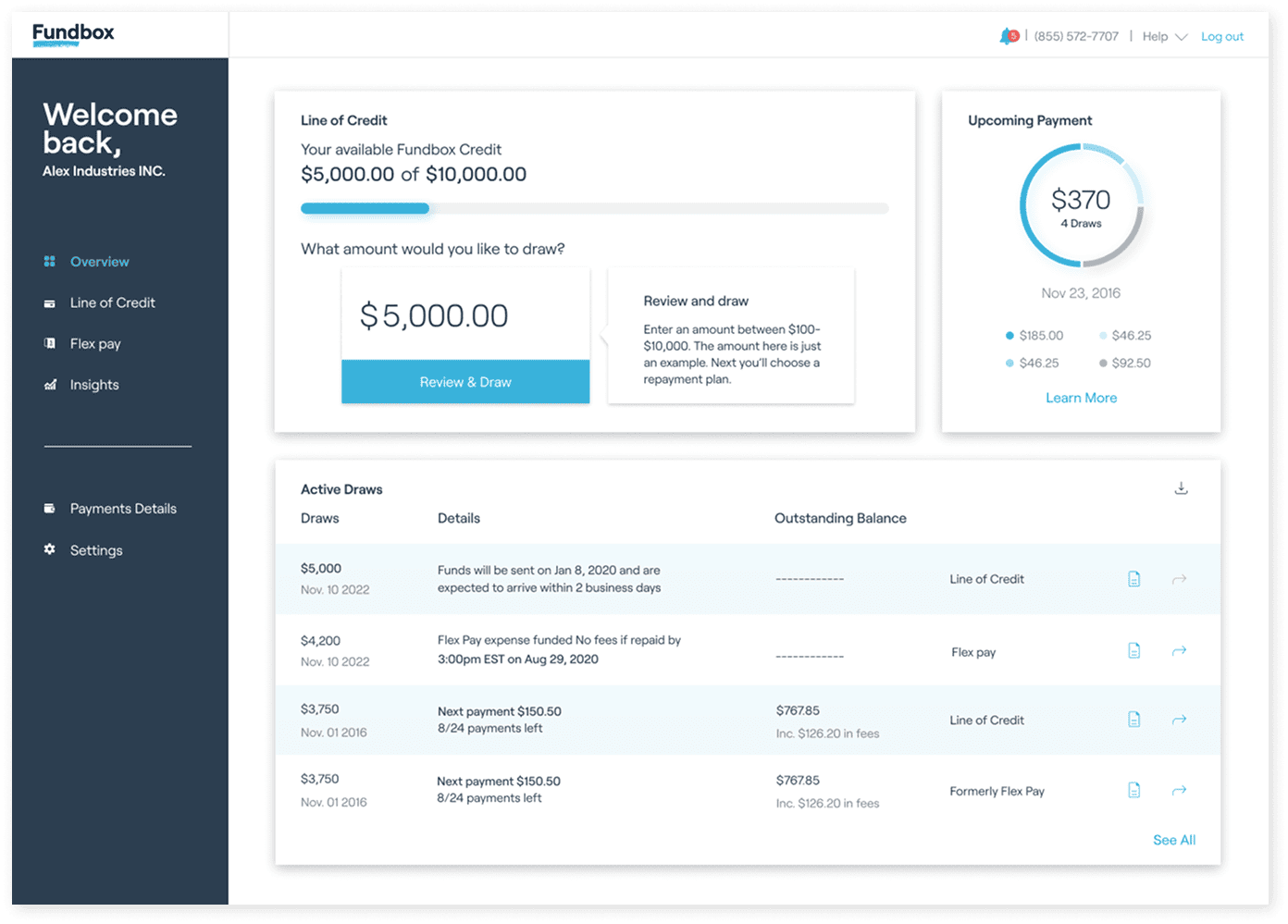
Products were lost in a single flat menu alongside settings.
Making products stand out drives discovery and draws.
A two-tier navigation model to design and maintain.
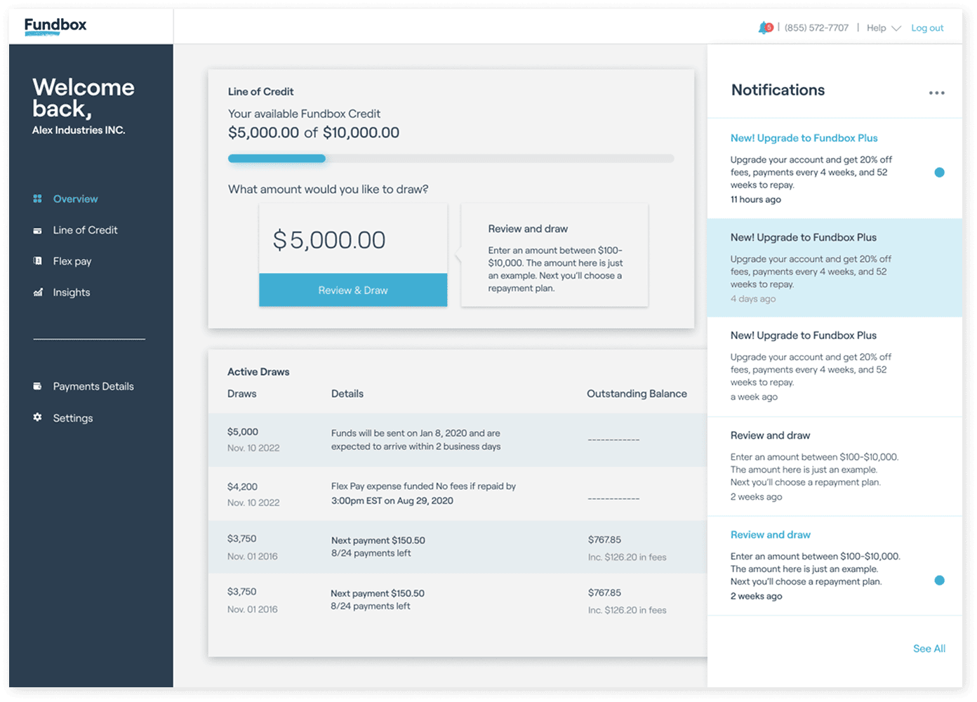
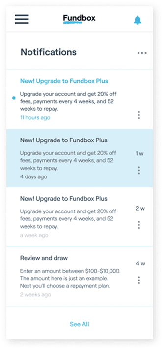
‘The message I saw yesterday disappeared’ — important messages vanished.
Reliable communication supports engagement and retention.
A message model with states, plus a page to maintain.
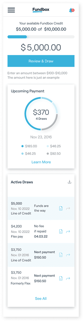
Real usage spans devices, not just desktop.
Reach across devices supports engagement.
Every module has to hold together at every width.
Prioritization
With the shared model in place, the work was sequenced against the business goal. The evidence pointed to one dominant lever — dormant credit — so effort went there first; new products would come later, as modules the shell is built to receive.
Prioritised — this phase
- The shared dashboard model, so every product has a home
- Surfacing available credit & a first-class draw action — the biggest lever for the draws goal
- The four-loan Draws view, sized to the data
- The payment breakdown and the message hub
Outside the scope of this phase
- New credit products themselves — the shared shell is built to receive them as later modules
- Work not tied to the immediate draws-and-engagement goal for this phase
The priority wasn’t a scoring framework — it was a judgement the team could defend: build the structure once, then spend the first phase on the change most likely to move draws.
Design Iteration
The solution wasn’t authored in one pass. It moved from the old single-product page, through wireframes worked out in product and design reviews, to the shared shell. Design and product reviews pushed the navigation from a single list toward the products/system split, and brought the nearest payment forward.
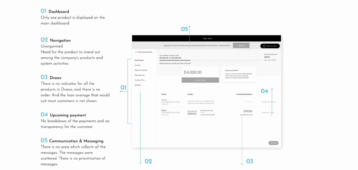
Structurally, the layout evolved from a dense single-product page, to a navigation grouped by product, to a module shell every product plugs into. Drawn as structure rather than screenshots, to show how the shell came together.
Final Product Experience
A journey, not a screen gallery: the route a customer takes through the new dashboard, each screen doing one job on the way from ‘where do I stand?’ to ‘take action.’
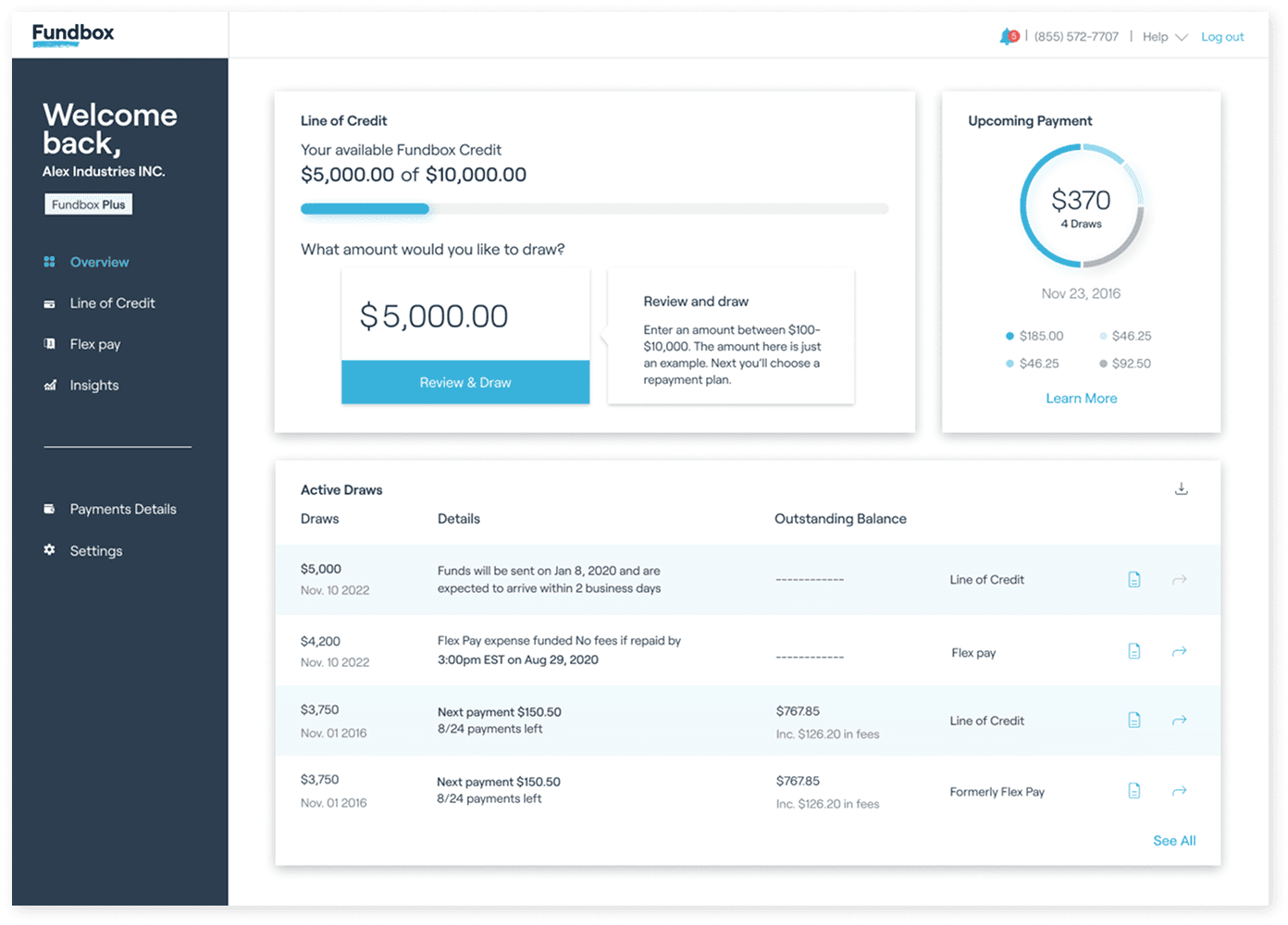
Every product, payment and message in a single view.
Navigation separates products from system activity.
Credit and a draw entry point, on any screen size.
The nearest payment, brought forward and broken down.
Alerts and messages, collected and prioritized.
Active draws, each labelled by product type.
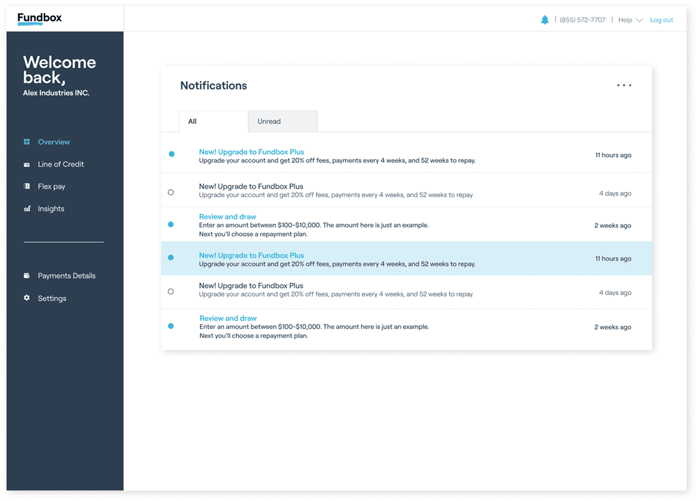
Manage and respond from the inbox — nothing is lost.
Design System
The design system wasn’t a UI kit — it was the mechanism that made new products cheap for the team to add. Building on Fundbox’s language, I promoted the primary dark navy from text into surfaces (alongside the existing turquoise), added a new icon language, and pinned down a type scale and button states — so any future module inherits the same shell instead of reinventing it.
Prototype & what it was built to move
I built an interactive prototype and adapted the shared model down to a 320px mobile layout — validation, not a deliverable. Testing the new navigation and the four-loan Draws view in motion pressure-tested the decisions before build, and the responsive layouts proved the model held together at every screen size.
Every decision above traces back to a goal the team set out to move: surfacing dormant credit for draws & origination, one legible home for engagement, and reliable communication for retention. Working with the product analyst, I helped define the success metric behind each lever — including draw activation on the 40.2% of accounts that never draw — and the events needed to track it, so the impact could be measured against a baseline once shipped.