


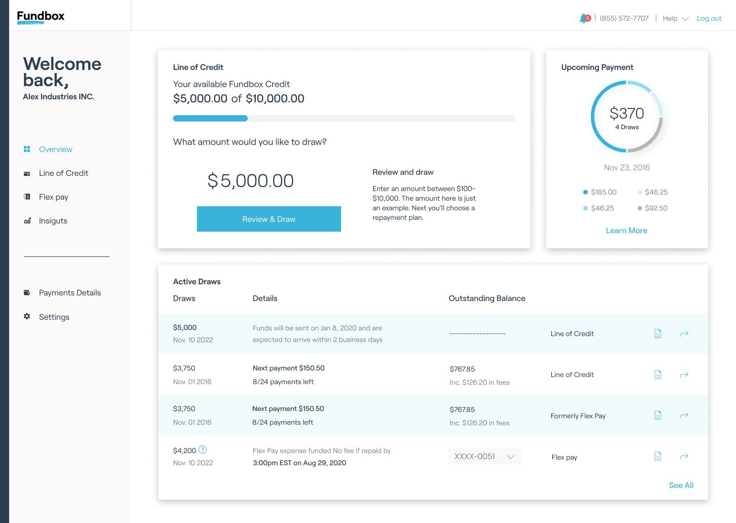
“I don't see all my products”

”I'm having trouble finding
where I update my details”

”I have several loans
and I don't know what type it is”

”I have no idea what the upcoming payment consists of”

”The message I saw yesterday disappeared”


“I don't see all my products”
”I'm having trouble finding
where I update my details”
”I have several loans
and I don't know what type it is”
”I have no idea what the upcoming payment consists of”

”The message I saw yesterday disappeared”

